
PACT Anti-Trafficking Awareness Website Redesign
Website Concept, UX Research, and WordPress Prototype


Project Type
Nonprofit Website Redesign
User Research
Mid-Fidelity & High-Fidelity Prototyping
Deliverables
User Personas
User Journey Map
Site Map
Mid-Fidelity Wireframes
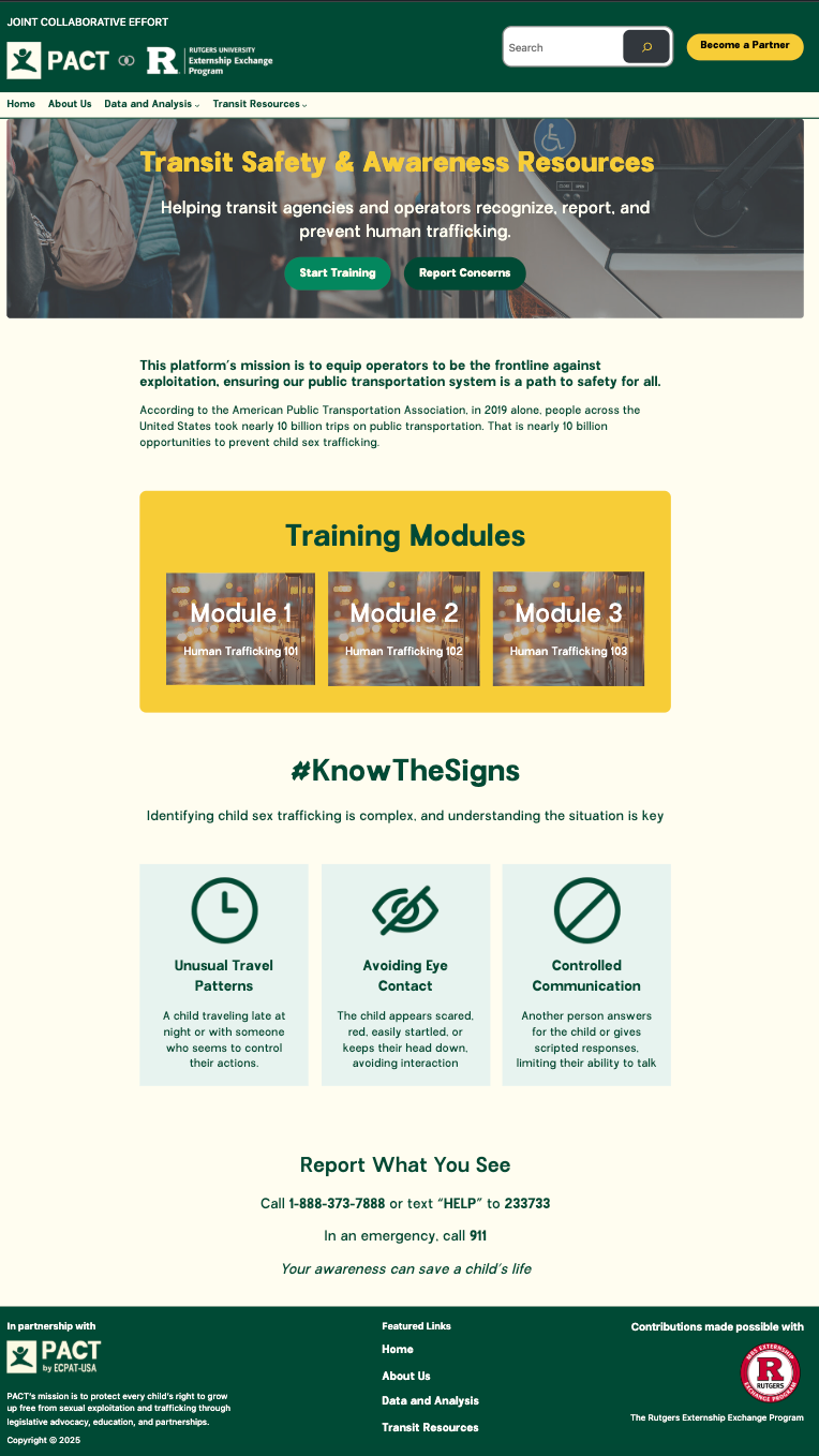
Beta WordPress Website
City-Based Data & Analysis Pages
Duration
4 Months
Tools
Figma
FigJam
Wordpress
SCENARIO
PACT is a nonprofit focused on preventing human and child trafficking through public awareness and community education.
For this externship, our team was tasked with designing a new awareness and reporting website that helps:
-
Transit agencies recognize and report trafficking
-
The public learn warning signs and prevention steps
-
Visitors access quick, reliable information
-
Users view trafficking data from three major cities: Albuquerque (NM), Chicago (IL), and Albany (NY)
PROBLEM
Information about trafficking online is often scattered, confusing, or overwhelming. Transit workers in particular need fast, actionable steps for what to do during an incident, while the general public needs straightforward education they can trust.
PACT needed a website that:
-
Centralizes all resources
-
Makes information easy to understand
-
Supports quick reporting
-
Displays city-specific data clearly
-
Builds credibility for a cause that depends on awareness
SOLUTION
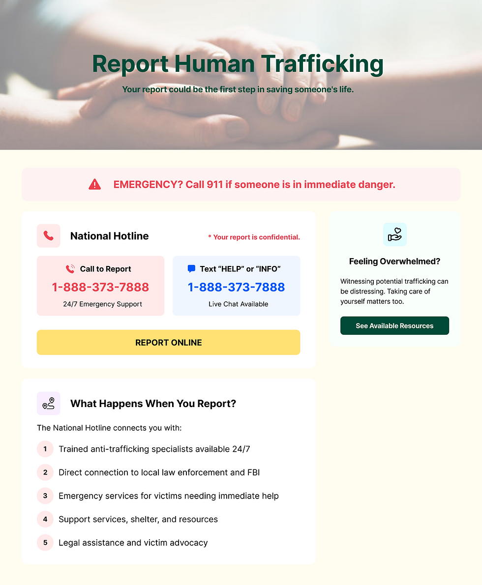
Our team designed the full information structure, mid-fidelity wireframes, and a beta WordPress prototype for a launch-ready website.
The final site includes:
-
A strong awareness homepage
-
Reporting guidance for transit agencies
-
Training and prevention resources
-
A data and analysis page featuring key trafficking data for NM, IL, and NY
-
A clean, accessible layout built around clarity and trust
My work focused on user research, persona development, IA, wireframing, and helping build the WordPress prototype.
PROJECT CONTEXT
WHAT FRAMED OUR WORK
Timeframe
The externship ran for 8 weeks, so we had to research, design, iterate, and build quickly.
Team Structure
A small UX team collaborated remotely with PACT mentors. We handled the full UX process, including planning, design, and WordPress implementation, without an engineering team.
Research Boundaries
We relied on:
-
Stakeholder conversations
-
Secondary research
-
Nonprofit and public-service website best practices
-
Existing transit reporting guidelines
No direct access to transit workers was available, so we synthesized needs from training materials and public safety protocols.
UNDERSTANDING THE PROBLEM
Why The Site Needed Redesigning
Early exploration revealed:
-
Confusing navigation and unclear page hierarchy
-
Important information buried in dense text
-
Lack of tailored resources for transit agencies
-
No consolidated page for data insights
-
Inconsistent visual layout and structure
OUR GOAL:
Create a streamlined, educational, and action-focused website that helps users quickly understand what trafficking is and what steps they can take.
RESEARCH + INSIGHTS
Research Synthesis
Based on content review and mentor feedback, we identified key user needs:
-
Transit workers need clear indicators, reporting steps, and quick access to protocols.
-
General visitors need simple, digestible education about human trafficking.
-
Advocates + partners need reliable data and context to support awareness efforts.
User Pain Points
-
Difficulty finding relevant information
-
No centralized resource hub
-
Insufficient visual hierarchy
-
Limited clarity on what actions to take
These findings shaped our redesign direction.
EXPLORATION + IDEATION
Opportunity Areas Identified
We brainstormed improvements like:
-
A simplified navigation structure
-
Dedicated educational pages
-
A transit-specific resource hub
-
Clear step-by-step reporting guidance
-
A data and insights page covering Albuquerque, Chicago, and Albany
-
More visual, modular page layouts
Persona
Primary Persona: Transit Operator
Needs fast access to reporting steps, warning signs, and contact routes.
Secondary Persona: Concerned Community Member
Wants to learn how trafficking happens and how they can help.

User Journey Mapping
We documented the steps users take when:
-
Learning about trafficking
-
Searching for reporting guidelines
-
Accessing city-level data
-
Browsing resources for training and workshops
Pain points included unclear navigation, overwhelming information density, and lack of structured guidance.

We reorganized the website into clear content groups:
-
Learn About Trafficking
-
Identify Warning Signs
-
Transit Agency Resources
-
Data & Insights (3-city overview)
-
Get Help / Report Suspicious Activity
This structure made information easier to find and reduced confusion.
Information Architecture

DESIGN DEVELOPMENT
Wireframes


We created mid-fidelity wireframes to map key flows:
-
Homepage
-
About Us page
-
Transit Resources
-
Data & Analysis
-
Reporting guidance
High-Fidelity Designs
After team review, we refined the visuals and changed our prototypes according to feasibility:
-
Clean layouts
-
Strong typography for readability
-
Clear content sections
-
Simple iconography and visual cues
-
Consistent spacing and hierarchy
WordPress Implementation
Half the team translated the initial designs into WordPress before we came together in the end to implement last final touches.
We:
-
Password-protected certain pages
-
Matched the visual system from Figma
-
Structured content for easy updates
-
Ensured accessibility and some mobile responsiveness


VALIDATION + ITERATION
Through ongoing mentor feedback, we refined:
-
Navigation labels for clarity
-
Data visualization for the 3-city overviews
-
CTAs to guide users toward reporting resources
-
Section layouts to improve scanability
FINAL OUTPUTS
✔ Full website wireframes
✔ High-fidelity prototypes
✔ New site architecture
✔ 3-city trafficking data and insights page
✔ Transit resource page
✔ Final WordPress implementation
✔ Presentation and walkthrough
KEY PROJECT OUTCOMES
-
Created a redesigned, user-friendly website for awareness and education
-
Improved navigation, clarity, and overall usability
-
Built transit-specific tools and guidance pages
-
Made trafficking data more accessible and interpretable
-
Strengthened alignment between PACT’s mission and user needs
PERSONAL REFLECTION
This externship strengthened my skills in:
-
Strengthened my leadership skills by organizing tasks, timelines, and team communication.
-
Structuring complex educational content
-
WordPress implementation and modular design
-
Wireframing for clarity and nonfiction content
-
Presenting research-backed design decisions
In a future iteration, I’d incorporate direct feedback from transit workers to validate the design more deeply.